Overview
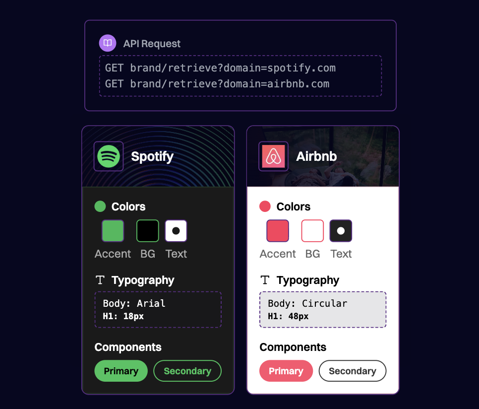
Creating a brand kit manually is tedious and time-consuming. Designers and marketers must hunt down hex codes, locate the right logo files, identify font families, and document spacing guidelines - often across scattered sources. For design software, email builders, and marketing platforms, this friction delays the moment users experience your product’s core value. Brand.dev automates this entire process. By fetching comprehensive brand data from any domain, your application can instantly generate brand kits containing:- Logo variants - Icons, full logos, light/dark mode versions
- Color palettes - Primary, secondary, and accent colors with hex codes
- Typography - Font families, weights, and usage patterns
- Design tokens - Spacing, shadows, and component styles
- Brand assets - Backdrops, hero images, and visual elements
Prerequisites
- A Brand.dev API key
- A design tool, email builder, or application that uses brand assets
Concept
When a user enters their company domain or email, Brand.dev retrieves their complete brand identity. Your application can then pre-populate a brand kit that employees can use immediately with no manual asset hunting required.Architecture
1. Collecting the User’s Domain
The brand kit generation starts when you know the user’s company. This typically happens during:- Account signup - Extract domain from work email
- Workspace setup - User enters company domain
- Project creation - User specifies client domain
The prefetch endpoint doesn’t charge credits and significantly improves response times for the actual brand data request.
2. Fetching Brand Assets
Brand.dev offers multiple endpoints to build a comprehensive brand kit: Brand API - Core brand data including logos, colors, and company information:3. Organizing Logo Variants
Brand.dev returns multiple logo variants. Organize them for different use cases:| Logo Type | Use Case |
|---|---|
logo + light | Navigation bars, headers on light backgrounds |
logo + dark | Dark mode interfaces, dark backgrounds |
icon | App icons, favicons, avatars, small displays |
transparent | Overlays, watermarks, flexible placement |
4. Building the Color Palette
Transform Brand.dev colors into a usable design palette:5. Extracting Typography
Use the Styleguide API or brand fonts data to populate typography settings:6. Presenting the Brand Kit
Once you’ve assembled the brand kit, present it for user confirmation:- Display the brand kit in an editable interface
- Show logo previews with selection options
- Present colors as swatches with hex codes visible
- Allow users to add, remove, or modify any element
- Provide a “Regenerate” option to re-fetch from source
Best Practices
1. Always Allow User Edits
Brand kits should be a starting point, not a locked configuration. Users may have updated branding, internal guidelines, or preferences that differ from their public website. Make every element editable and saveable.
2. Provide Sensible Defaults
When brand data is incomplete (missing secondary colors, no dark mode logo), generate sensible defaults rather than leaving gaps. Use color theory to suggest complementary colors, or provide placeholder assets.
3. Cache Brand Kits
Once a brand kit is generated and confirmed by the user, cache it in your application. This prevents unnecessary API calls and ensures consistency across the user’s projects.
4. Offer Multiple Logo Options
Don’t auto-select a single logo. Present all available variants and let users choose which works best for their specific context. What works for a website header may not work for an email signature.
5. Handle Missing Data Gracefully
Not all companies have comprehensive brand data available. Provide a graceful fallback experience:
Example Use Cases
Design Software
Automatically populate brand colors, fonts, and logos when a user starts a new project, ensuring all designs stay on-brand from the first click.Email Marketing Platforms
Pre-configure email templates with company colors, logo placement, and typography so marketers can send branded campaigns without design skills.Website Builders
Generate starter themes based on the user’s existing brand, reducing setup time and ensuring visual consistency.Presentation Tools
Auto-apply brand colors to slide templates and insert logos in appropriate positions for professional, consistent decks.Marketing Asset Generators
Create social media graphics, ads, and banners that automatically use the correct brand assets and color schemes.Related Resources
Brand API Reference
Retrieve logos, colors, and brand assets
Styleguide API
Extract typography, spacing, and design tokens
Core Concepts
Understanding logo types and color data
Onboarding Flows
Pre-fill user data during signup